
Devlog · Episode 23
The death screen should not be a punishment
Falling in combat happens. Here is how I redesigned the defeat screen to help and not to punish.
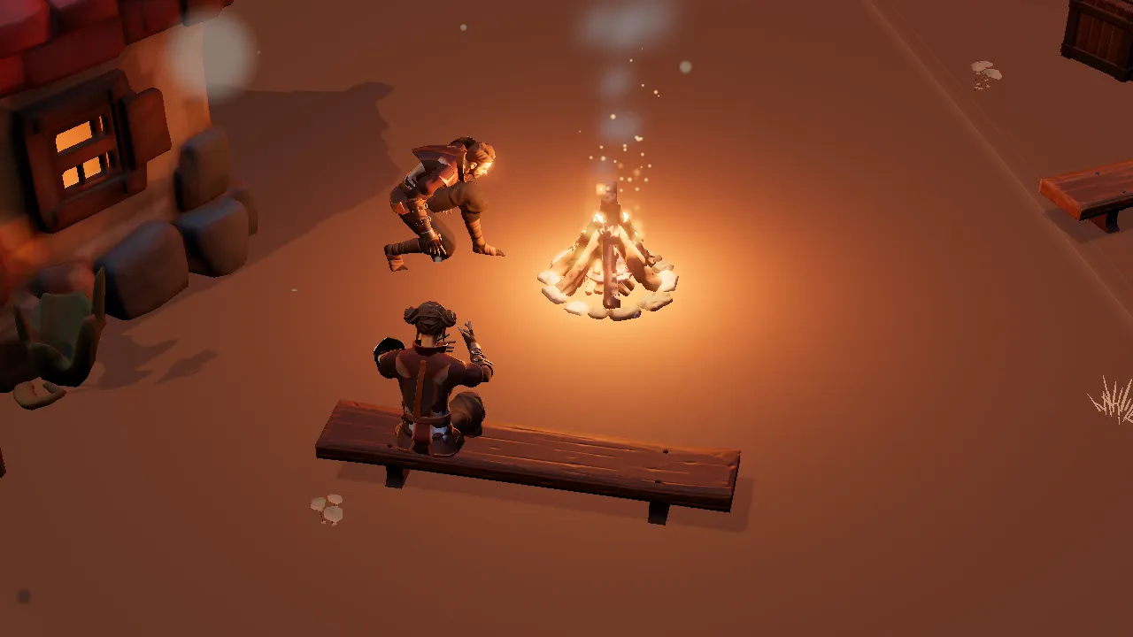
The first death screen I made was a dark frame with a button. It worked, but every time I died in testing I felt the same thing: I had been scolded. And dying in a game like this happens all the time, it cannot feel like a scolding.
What was wrong
The screen explained nothing. You died, everything went dark and a button was left. No idea what you lost, no idea what you could do, not one word that sounded like a person. For someone learning the game, that weighs more than the death itself.
I also noticed that death always came at the worst moment: in the middle of a fight, a climb, a talk with a character. If the screen arrives dry, the player leaves the game. If it arrives kind, they try again.
What changed
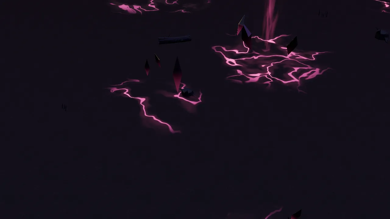
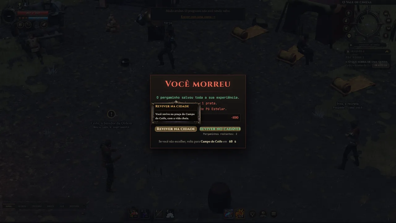
I thought of the death screen as a breather. Now it shows what happened, says in one short line what you lost and shows the way back in a few steps. You choose whether to revive in town or where you fell, and you see how much time you have to decide.
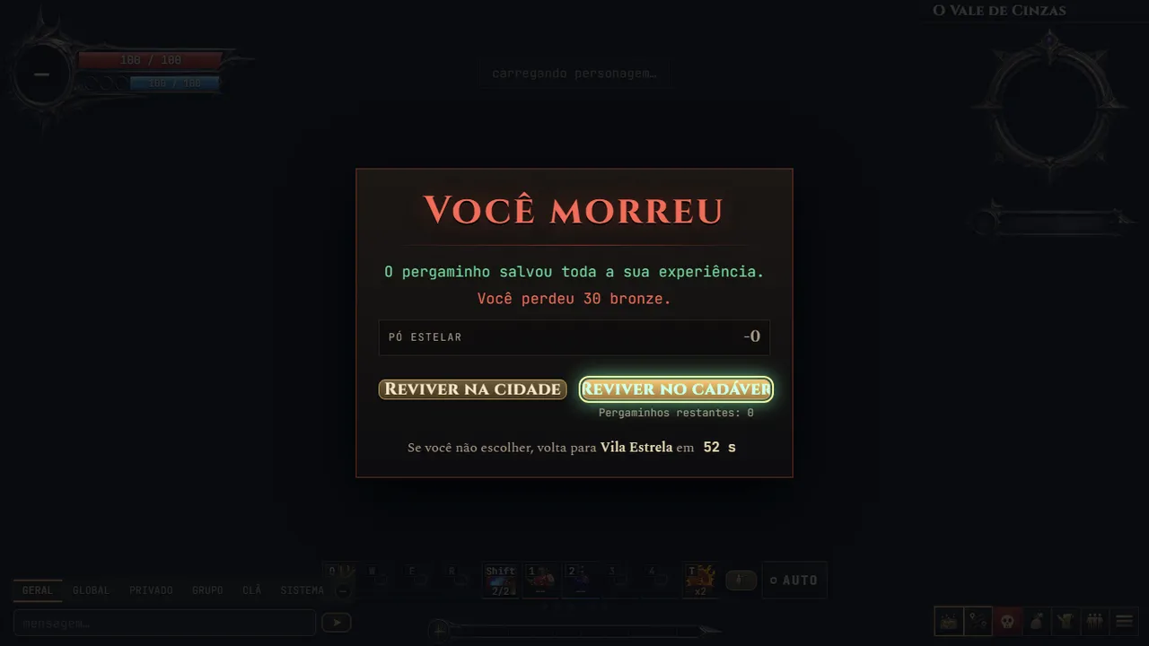
One thing I made sure to keep clear: when you have a resurrection scroll, the screen says it saved your experience. Losing progress was what hurt the most, so saying it right away changes the tone.
Color, music and text
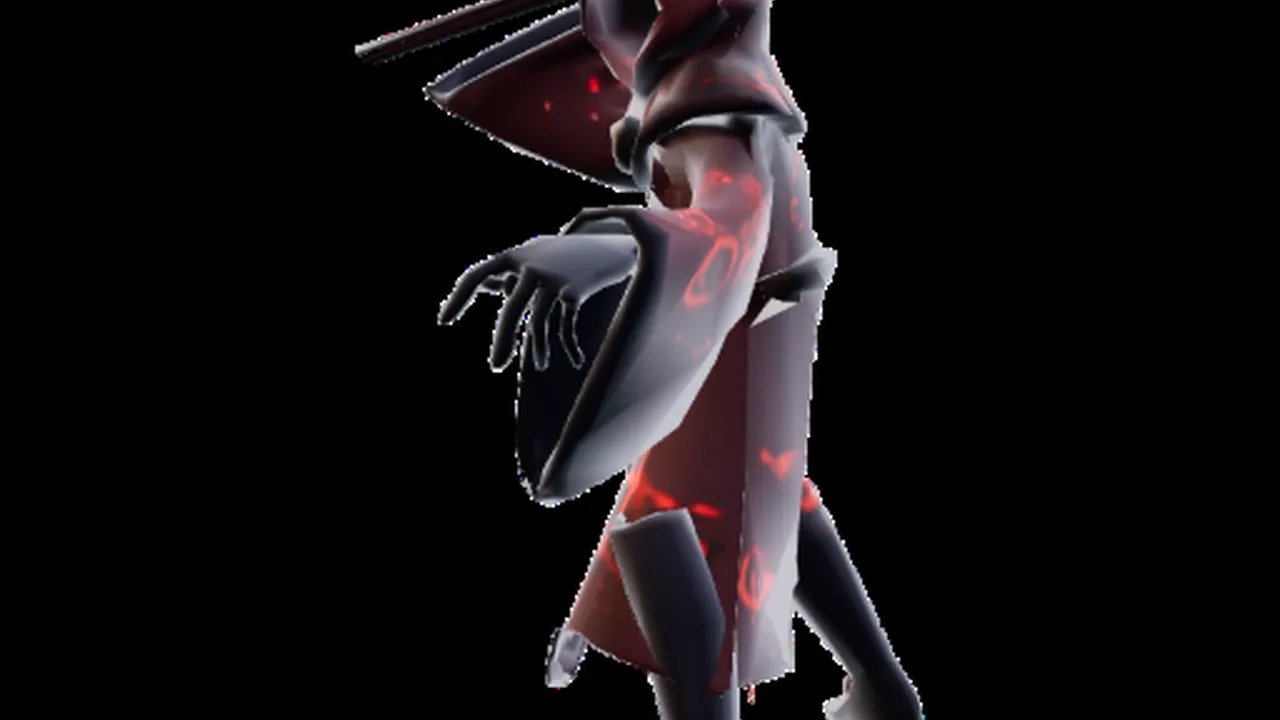
The color changed, the music drops and the text got more human. Instead of a dry notice, the screen talks to you. Each point is small, but together they change the feeling: from punishment to a pause.
I wanted the death screen to look like the game. No error window, no system notice. It is a scene inside the world, with the same typography and the same care as the other screens.
In the lairs too
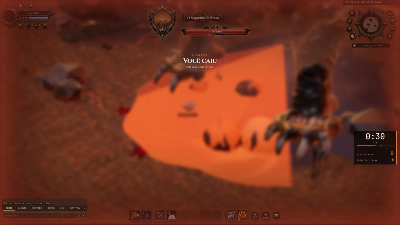
In dungeons and lairs the screen is different, because the context is different. There it shows how much damage you dealt in that run and how much time is left. A death there still counts, and the screen keeps that in sight.
I still want to adjust details, like the timing of each step. But the idea stands: dying is part of it, and the screen only needs to help you get back.
Dying in a game is never going to be pleasant, and I do not want it to be. I just want the screen after the fall to be clear, short and fair, so you get back to playing quickly.