
Devlog · Episode 27
My game turned into dark anime
The world, the creatures, the interface, the entry screen and the opening of Cavaleiros Celestiais moved to a dark anime style. Here is why, and the stumbles along the way.
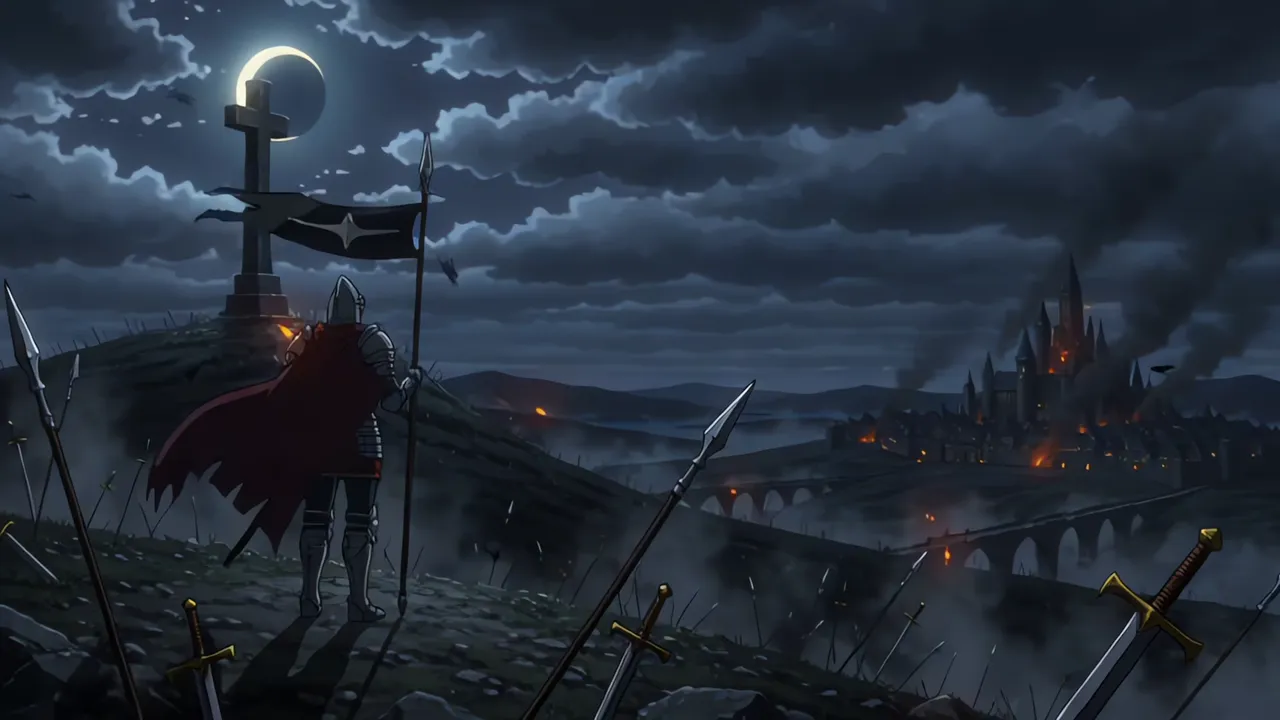
Why anime
Cavaleiros Celestiais has a new face. The world, the creatures, the interface, the entry screen and the opening now have a hand drawn look, leaning into a dark anime style.
I will be honest about the reason. One of the main ones was hiding the flaws in the graphics. An indie game has few resources. We do not have a whole studio to make every model perfect, and in a realistic look every flaw shows: repeated textures, slightly crooked pieces, creatures that look like dolls.
In an anime style, the outlines and the flat shadows hold the image together, and the flaws get lost inside the style. For a game our size, this is the best way out. And it does that very well.
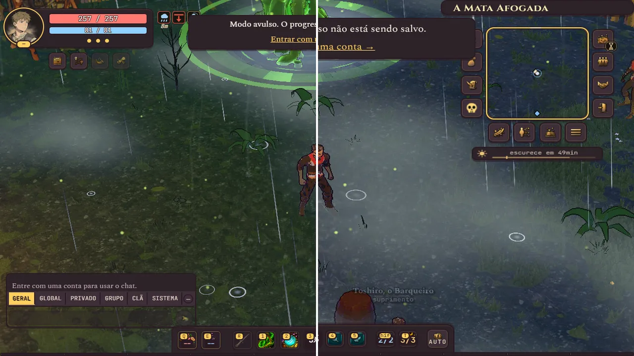
More anime, less glare
Before deciding, I asked for two test recordings, before and after, in different places, with combat and creatures. I liked it, but it was not enough. I asked to push it further into anime and keep the dark side. But dark does not mean a dark game. Dark means no glare.
Everything in the same style
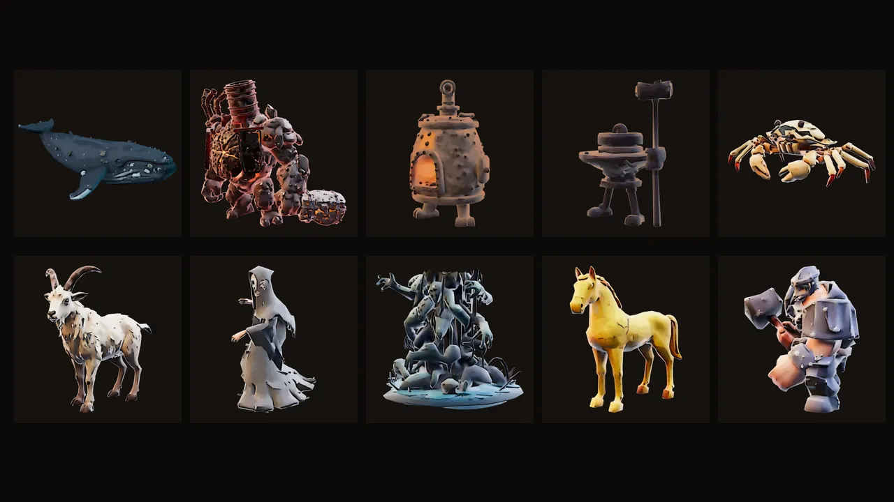
After that, the rule was one hundred percent, with nothing old left behind. Bosses, creatures and mounts got the same look. The interface got a new theme, and the minimap and the skill bar, which were crooked, went back where they belong. Even the damage numbers became drawings.
The cards, the Códex and the loading screens moved to the same style, almost nine hundred images. The entry screen became an animated scene, and the opening of the game was redone from scratch.
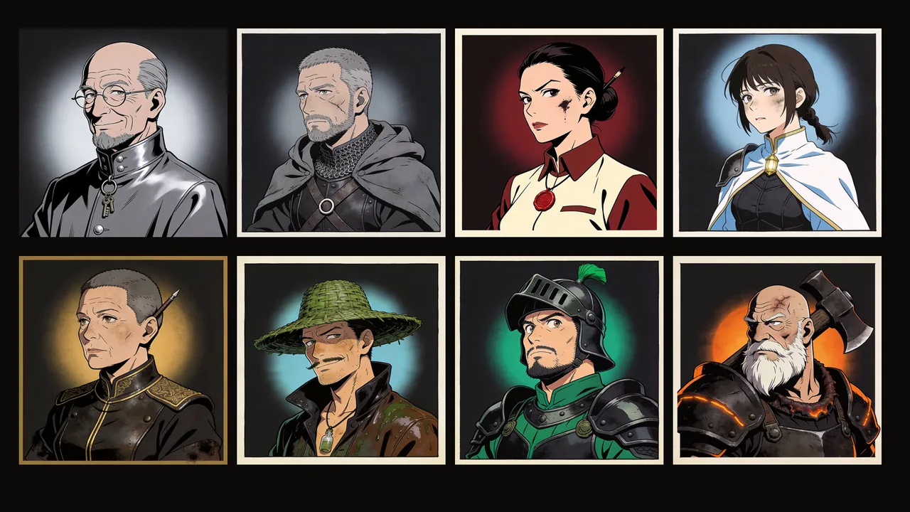
The townsfolk got anime portraits in their conversations.
And more
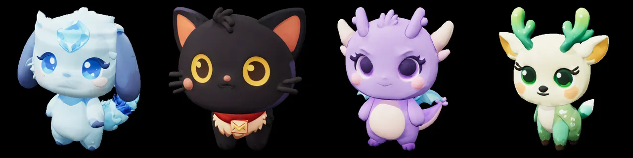
There was news beyond the look. Water got reflections. A rare item hitting the ground now makes a sound, and the rarer it is, the better it sounds. I thought the pets were really ugly and asked for brand new ones: a crystal spirit, an ink cat, a little stone dragon and a fawn. And the Guardiões scattered across the map got a drawn title for whoever takes them down.
The stumbles
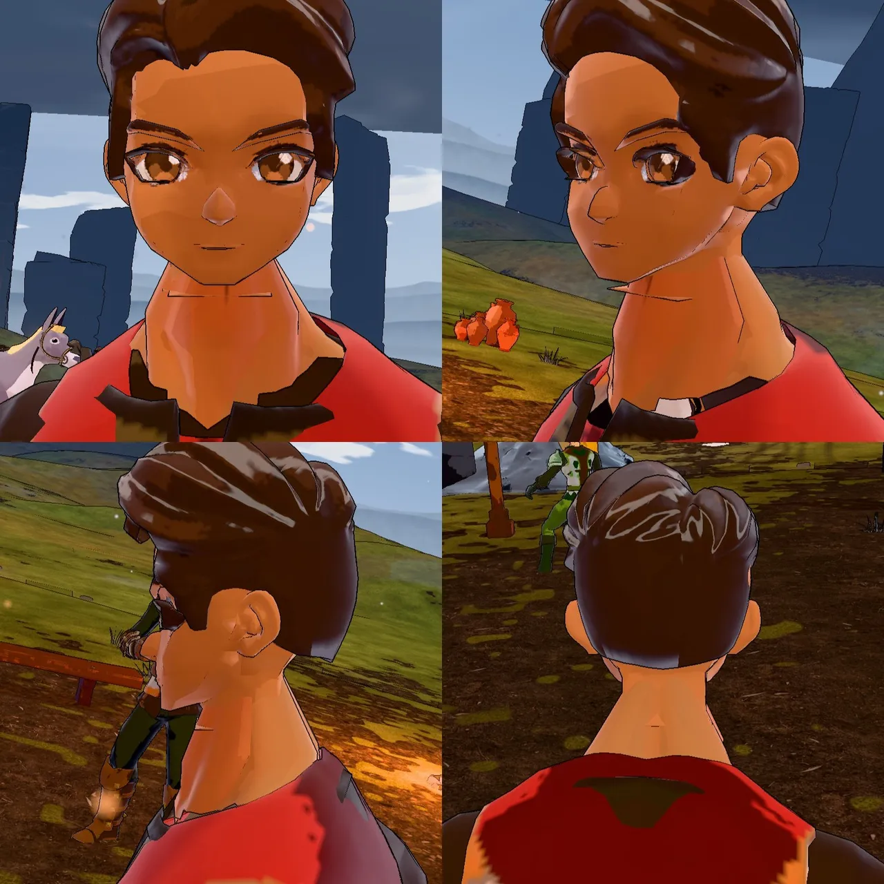
There was an attempt to swap the knight's head for an anime head. I looked at it, thought it was awful and had it reverted on the spot. At first, every blade of grass got a black outline, and the ground looked like a scribbled notebook. After the switch, the creatures of A Bacia Seca turned completely white, as if nobody had painted them. And the dragon of O Covil do Supremo, which used to have its foot buried in the ground, decided to float. Now it stands firmly and flaps its wings.
Do you prefer the old look or the dark anime?